


The Dopamine Effect: Why Autumn/Winter 2026/27 Is Injecting Hits Of Colour
16-10-2026


Against a backdrop of dark dressing and an increasingly unsettled world, fashion is embracing high-voltage colour as a welcome hit of optimism. From electric cobalt and tomato red to cerise pink and acid lime, the message for the season ahead is clear: when everything feels a little darker, wear something brighter.
There is something undeniably powerful about colour. It can shift a mood, command attention and transform even the simplest outfit into a statement. For A/W26/27, fashion is harnessing that power through a striking interplay of dark, understated foundations and unapologetically vibrant accents.
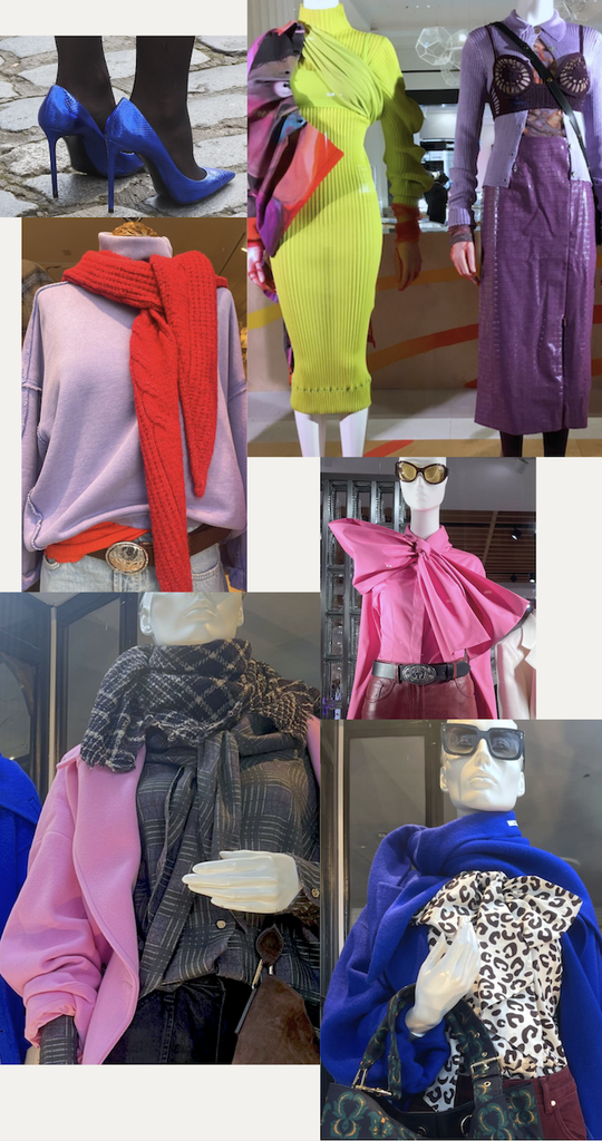
Black, chocolate brown, charcoal grey and deep berry continue to anchor the winter wardrobe, providing the perfect canvas for unexpected bursts of high-octane colour. But rather than dressing head to toe in brights, the approach is more considered: a single electric-blue coat, a flash of a chilli red scarf, a cerise-pink knit or a jolt of acid green against an otherwise muted look.
Call it dopamine dressing, winter edition. The effect is less about abandoning sophistication and more about injecting personality, energy and optimism into everyday wardrobes.
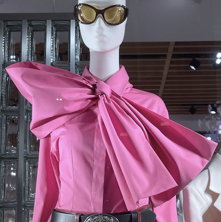
While the designer collections often provides the inspiration, the high street is already offering accessible ways to embrace the mood, from cerise pink pussy bow blouse at Mango to the confident, polished red sweater at ME+EM.
Blue Monday? Not This Season
Electric blue and saturated cobalt are emerging as some of the most compelling ways to make a statement this winter. Bold, graphic and almost impossible to ignore, these shades offer a refreshing alternative to the season’s familiar neutrals.
Think oversized coats, substantial knitted turtlenecks and beautifully cut separates in unapologetic blue, worn against charcoal tailoring, dark denim or head-to-toe black. The contrast is what makes the look work: the silhouette remains classic, while the colour does all the talking.
The visual language of designers such as Jil Sander and Bottega Veneta provides a useful reference point for this clean, confident approach to colour. The key is to let the shade stand alone rather than dilute its impact with too many competing elements.
For everyday dressing, a cobalt jumper beneath a dark wool coat or a vivid blue accessory against chocolate brown delivers the same effect with considerably less commitment.
Seeing Red: Tomato, Scarlet and Chilli
Red has long held its place as fashion’s ultimate attention-grabber, but for A/W26/27, it feels particularly relevant. From bright tomato and fiery chilli to rich, saturated scarlet, red is stepping beyond the traditional festive palette to become a year-round wardrobe power player.
Its appeal lies in its versatility. Against black, it feels dramatic; paired with chocolate brown, it becomes unexpectedly luxurious; alongside grey, it lends an otherwise restrained outfit a welcome shot of energy.
Design houses including Chanel and Loewe offer inspiration for the expressive potential of red, particularly when it is worked into tactile fabrics and strong silhouettes. Rather than relying on sparkle or embellishment, the colour itself becomes the statement.
Red can be found in great supply on the high street, from knits and sharply tailored jackets to statement coats, red can bring immediate impact to familiar separates without sacrificing wearability.
The new rule? Treat red as a neutral. Wear it with the same confidence as black, and let it earn its place in your everyday rotation.
Purple Rain: Royal Violet, Deep Berry and Electric Fuchsia
Purple is taking a more adventurous turn, moving beyond the depth of aubergine and plum into vivid violet, saturated royal purple and electric fuchsia.
These shades offer two distinct moods. Deep purple feels introspective and luxurious, while its brighter counterparts are playful, expressive and deliberately attention-seeking. Together, they create an interesting tension between the dark romanticism traditionally associated with winter and a more optimistic, high-energy aesthetic.
The most directional way to wear them is through unexpected colour combinations. Try fuchsia against burgundy, violet with chocolate brown or a bright pink knit beneath a charcoal coat. For those who prefer a more dramatic approach, tonal dressing in different shades of purple creates a confident, almost graphic effect.
Celine and Mugler provide useful points of reference for exploring the relationship between saturated colour, attitude and silhouette. A flash of pink against a dark outfit can be every bit as effective as a head-to-toe look. Sometimes, one piece is all you need.
Acid Test: Chartreuse and Wild Lime
For those who prefer their colour with an edge, acid chartreuse and wild lime are the shades to watch. Sitting somewhere between green and yellow, these citrus-inflected tones bring an almost electric intensity to traditional cold-weather dressing.
Their success depends on contrast. In lightweight fabrics, lime can feel distinctly summery; worked into heavy wool, brushed knitwear, mohair or substantial outerwear, it becomes something altogether more modern. The clash between the unexpected colour and the weight of the fabric is precisely what gives the look its appeal.
Prada’s wider design language provides a useful reference for this more experimental approach to colour, where familiar wardrobe pieces can take on a new personality through an unconventional shade or styling combination.
A lime-green scarf against a chocolate-brown coat, a chartreuse knit with dark denim or a bright accessory against an all-black silhouette offers an easy entry point. For the bolder dresser, a statement coat in acid green can transform even the most understated winter uniform.
It is not necessarily an easy colour to wear, but that is part of its appeal. These shades are designed to disrupt, challenge and, above all, be noticed.
From the Catwalk to the Fashion Pack
The wider significance of this colour story extends beyond the individual shades. As the fashion calendar moves into SS27 and beyond high-impact shades continue to shine in tandem with pastels and neutrals. According to the Pantone Color Institute colours such as candy pink, chilli pepper, lavender, cobalt and yes, more red, will continue the colour story into next season.
Dressing for a Little More Optimism
There is also a more emotional dimension to fashion’s renewed appetite for brightness. Against a backdrop of international conflict, political uncertainty and relentlessly difficult news, the appeal of colour feels particularly resonant.
Fashion cannot resolve the realities of the world beyond it, and a bright outfit is not a substitute for confronting them. But getting dressed can still be a small, personal act of expression. Choosing something vivid, joyful or unexpected can offer a moment of pleasure and a reminder that creativity and optimism have a place even in difficult times.
Perhaps this is why dopamine dressing forging a clear path over the next two seasons. It is not simply about chasing a fleeting mood or following a social-media trend. It is about recognising the emotional relationship we have with the things we wear, and allowing that relationship to feel a little more playful.
Images by JoJo Iles


