


The Power of the Window: How Visual Merchandising Can Stop the Crowd

15-12-2025


In an era of endless scrolling and same-day delivery, the physical store window remains one of retail’s most powerful marketing tools. A well-considered window doesn’t just display product, it tells a story, signals brand values, and invites customers to step inside.
This festive season in London, some of the most effective window displays prove a crucial point for independent retailers: impact doesn’t come from scale or spend, but from clarity, creativity and restraint. Bond Street budgets aren’t required to stop people in their tracks, (although Bond Street, once again, has drawn-in the crowds loving the festive spectacle.)
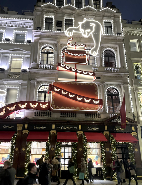
(Big budget – Cartier on Bond Street)
Storytelling Over Spectacle
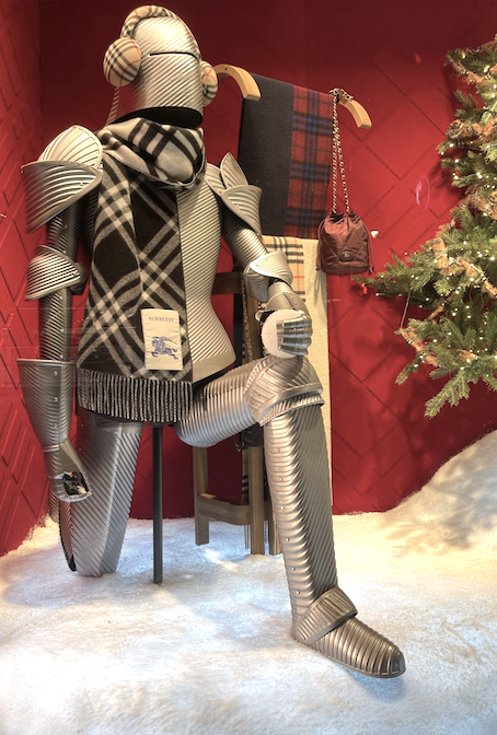
(Burberry)
Burberry’s Christmas windows offer a masterclass in how humour and brand DNA can do the heavy lifting. With the playful line “’Twas The Knight Before…”, the brand reimagines its iconic Equestrian Knight motif in a festive setting. Mannequins dressed in winter scenes wear Burberry pieces paired with unexpected knight’s armour, a witty visual twist that instantly communicates heritage, confidence and charm.
The takeaway? You don’t need complex mechanics or digital installations. A single strong idea, executed consistently, creates memorability – something small, independent retailers can absolutely own.
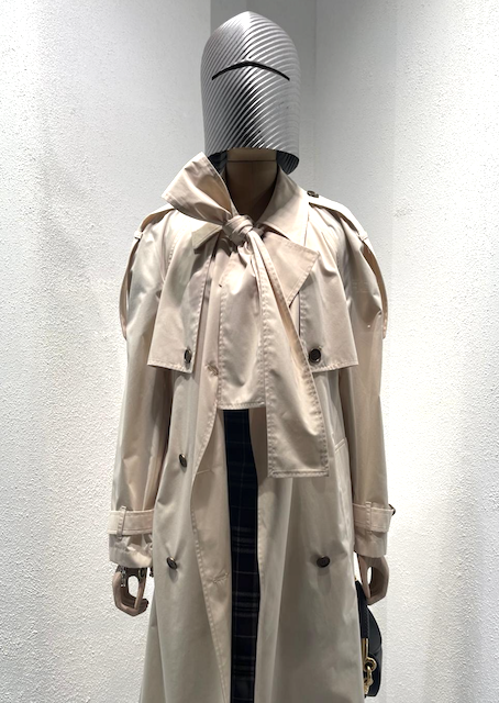
(Burberry)
Small Scale, Big Impact
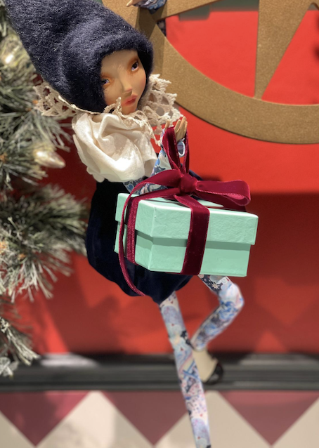
(Liberty)
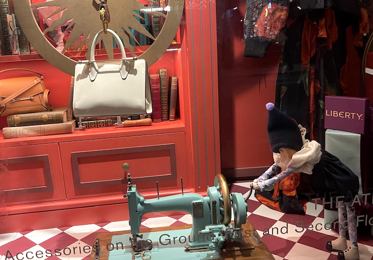
(Liberty)
Liberty’s festive windows take a very different, but equally effective approach. Instead of grandeur, they lean into intimate storytelling. Each window becomes a glimpse into an elf workshop, populated by whimsical, slightly manic elves hard at work making Christmas gifts.
The scenes are dense but deliberate: pulleys, ropes, twine and tools create a chaotic yet charming environment that feels handcrafted and human. Crucially, everything is scaled down, allowing attention to naturally fall on smaller items, such as accessories, jewellery, scarves and gifts.
For smaller retailers, this is a vital lesson:
- Working at a smaller scale draws customers closer to the glass
- It encourages lingering and detail-spotting
- It’s particularly effective when selling high-margin, small-format products
Tod’s echoed this approach beautifully with a snowy alpine backdrop populated by miniature skiers and winter walkers weaving through handbags and boots. The product remains the hero, but the miniature world around it adds narrative and emotion.
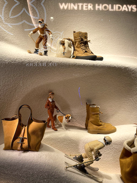
(Tod’s)
The Discipline of Colour and Space
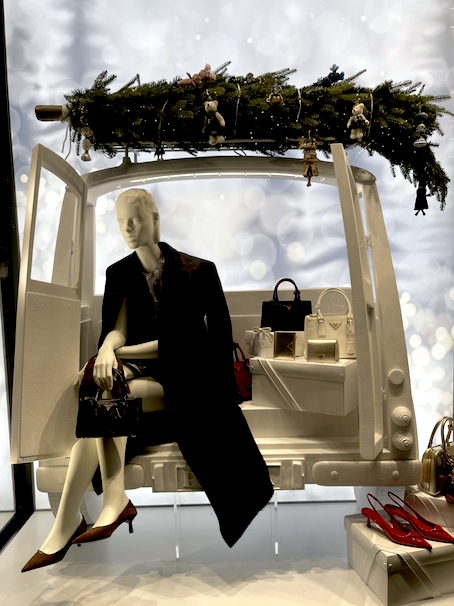
(Prada)
One of the most consistent themes across successful Christmas windows this year is restraint, particularly when it comes to colour and background.
Many of the strongest displays use no more than three key colours, allowing the merchandise to truly stand out. Clean, uncluttered backdrops create visual calm in busy streets, making windows easier to read at a glance.
Prada’s snowy white window is a standout example. A crisp, white backdrop sets the stage for a mannequin positioned in the back of a stylised, snow-sprayed car. Against the neutral setting, carefully chosen pops of colour – red shoes, a red handbag, sleek black accessories and clothing draw the eye immediately to the product.
This approach is highly transferable:
- White, cream or neutral backdrops are cost-effective
- Fewer colours create stronger impact
- Product becomes the focal point, not the set
Inspiration For Independent Retailers
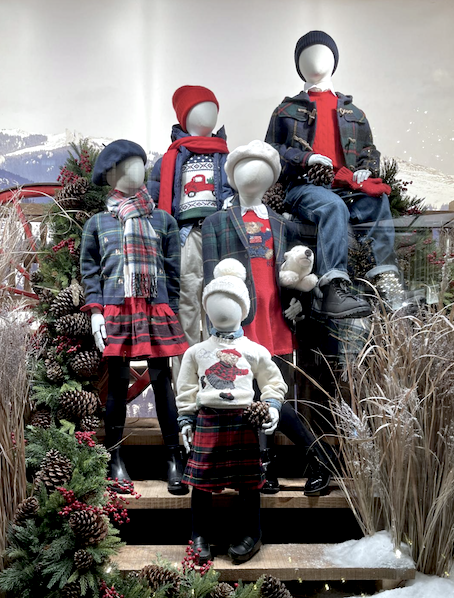
(Ralph Lauren)
This season’s London windows reinforce a powerful truth: visual merchandising is about intention.
You don’t need:
- Large-scale builds
- Expensive materials
- High-tech installations
You do need:
- A clear story or idea
- Strong editing — less really is more
- Thoughtful use of colour and scale
- Confidence in your product
A window that makes someone smile, pause, or lean in for a closer look is already doing its job. In a competitive retail landscape, that moment of connection can be the difference between being walked past or walked into.
For independent retailers, the message is clear for window displays that span the year: think small, think smart, and let your windows speak with purpose.
Words and images by JoJo Iles


